Branding by design stories
LISTEN. Every brand has a story to tell. Be it a person (Bugs Bunny), a place (Planet Mars) or a thing (Chia Pet) a brand is a distinct set of values that resonate with whomever it comes in contact. Creating brand believers begins with uncovering a brand's DNA. From its inception a brand has a distinct set of characteristics that are uniquely its own. THINK. With research and brainstorming a brand's DNA is uncovered and its personality is revealed. This discovery process inspires what color best represents its tone, what visuals best communicate its personality, what typeface delivers the right message and even the sound of its voice. Once a brands values are discovered its story begins. CREATE.
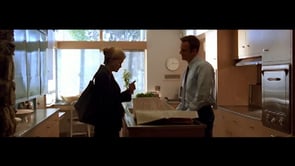
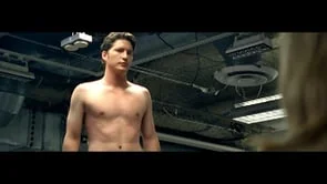
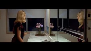
LISTEN. With hospital expansion plans underway including a new maternity care tower, and a competitor building a new facility, Swedes realized their best tactic to solidify their trusted health partner stronghold in the Rockford community was to expand their community of “Swedes Believers.” THINK. Rather than panic and resort to typical hospital visuals of doctors in lab coats, Swedes moved forward with confidence. CREATE. For the “A Moment In Time” campaign Swedes turned the camera away from the hospital and towards the Rockford community. These 15 second movies capture relatable, everyday moments of real Rockford families to communicate Swedes true understanding of Swedes families. “Season 2” added an anthemic spot covering lifes journey as well as additional :15 moments spots where some of our families returned for an encore!
This episode features the 1st birthday of the newborn we saw sleeping on his dad’s chest in season 1.
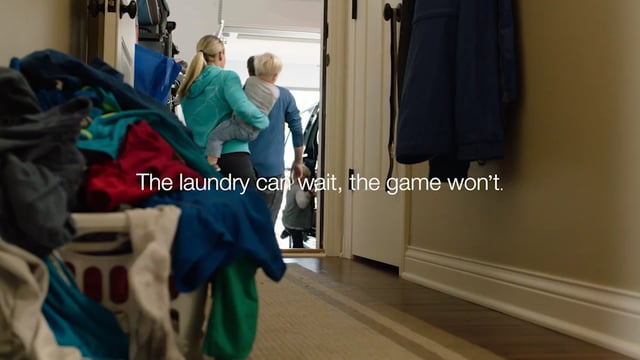
This family was rushing off to a soccer game in Season 1.
We saw Dad braiding his daughters hair in Season 1.
We finally get a glimpse at who was behind that bathroom door in Season 1.
Google braiding
Me time
Selfie
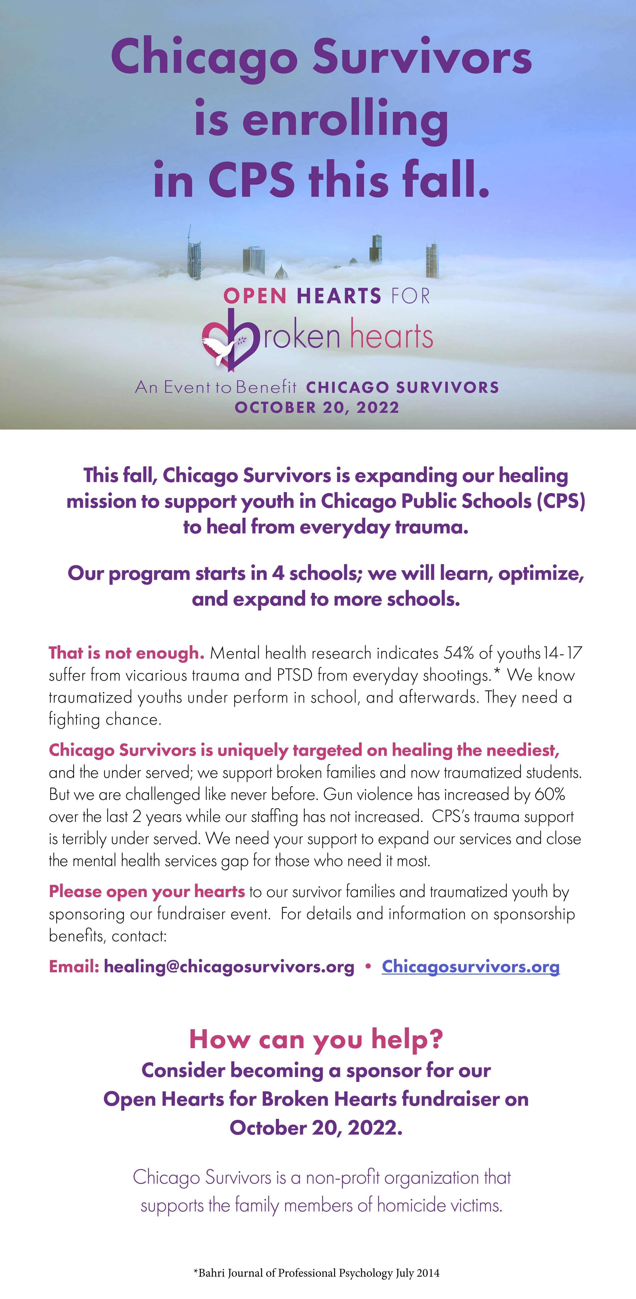
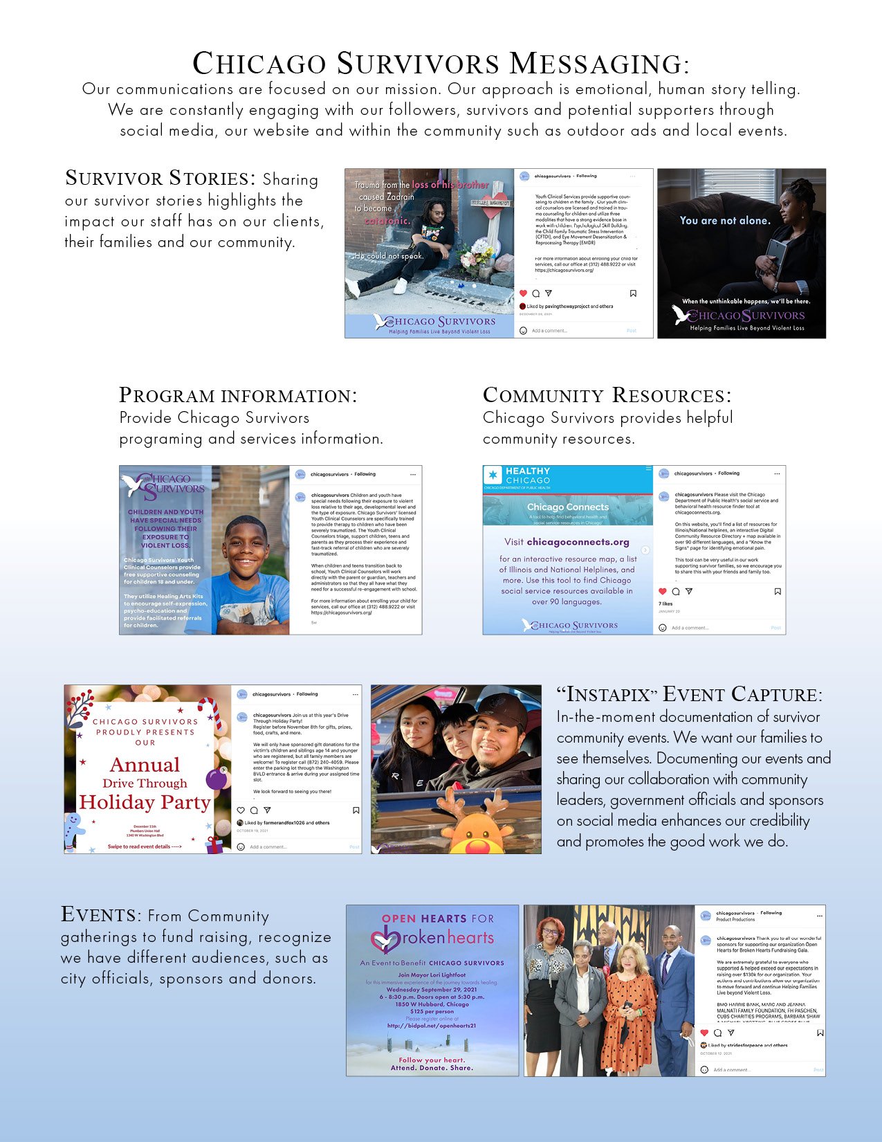
LISTEN. As gun shots ring out in the greater Chicago area, there’s a non-for-profit organization dedicated to “Helping Families Live Beyond Violent Loss”. Chicago Survivors provides multicultural crime victim services to the family members of Chicago homicide victims. THINK. Families need to know who to call to guide them through these unthinkable tragedies. They also need to know that neuroscience is the “how we heal.” Finally, a constant stream of funding is needed to continue their work until, someday, they are no longer needed. CREATE. The survivors are the true stories here. So let’s tell their stories. By sharing their stories we give others the opportunity to open up and ask for help snd prospective donors see who their contributions benefit.
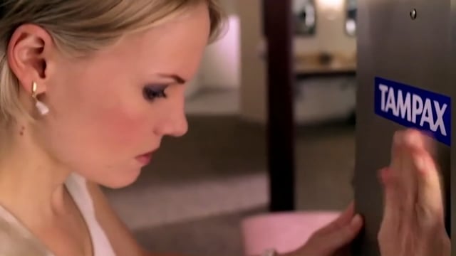
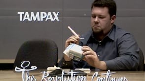
Born in 1936, Tampax is arguably the most uniquely feminine brand in a women’s medicine cabinet. LISTEN. Ironically, Tampax found itself suffering from a masculine image due to its outdated blue packaging, its unfeminine, bold, san-serif typefaces and its antiquated messages. Tampon advertising long suffered embarrassing messages of dependability using blue goo or depicting smiling girls riding white horses while wearing white pants as symbols of efficacy. Tampax was no exception. THINK. Revamping and feminizing the brands image required delving into its history where a direct correlation to the forward progress of women was discovered. CREATE. “The Revolution Continues” campaign was born to re-invent the Tampax image in order to represent feminine strength and innovation. The “T” in Tampax was replaced with a female symbol giving it a dual meaning: first as the “T” in Tampax and secondly as a symbol of feminine strength. As the success of the campaign continued, the Tampax blue was minimized to make room for a more feminine color palette; the type was given a softer hand drawn feel to communicate approachability. When it came to the tone or voice of Tampax, the double meaning of “you’ve got to be a women to get it” was adopted. In other words, since women are the only gender to experience needing Tampax the messages should only be understood by women. The embarrassment of seeing a tampon commercial while watching a movie with your boyfriend was eliminated and the execution was invariably more watchable.
College campus poster
To the woman
Campaign launch spot firmly puts a flag in the ground to claim their place as the quintessential women’s brand
Thunderstorm
Multi-pack message done in a revolutionary way
Vending machine
Depicts brand affinity
Compakmania
Product intro and innovation in one “Say it loud and proud” spot!
Even men are amazed
Product innovation and demonstration
Thank you for hearing me
Support of women’s rights and issues
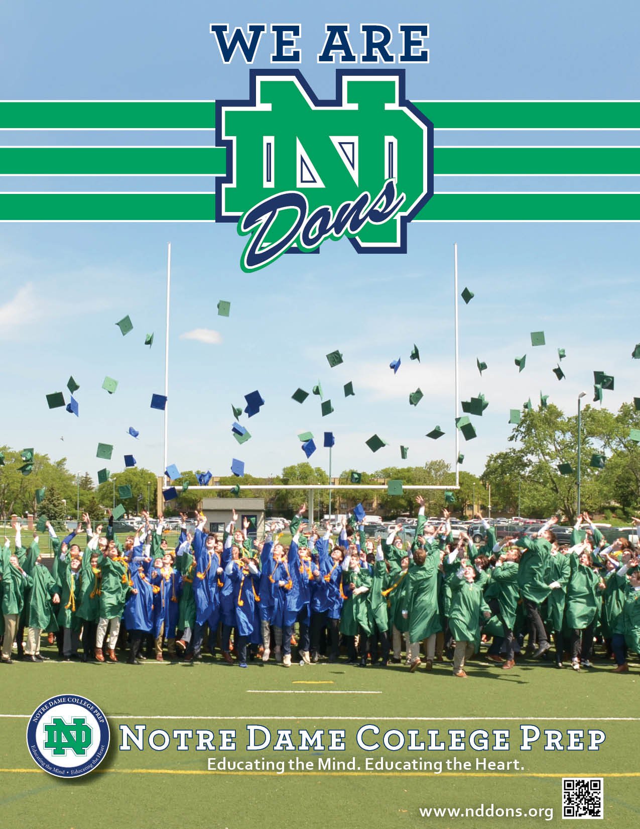
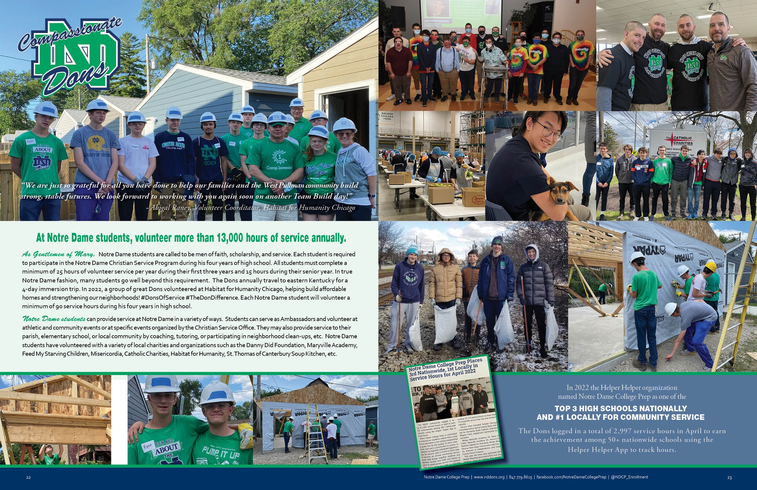
“Modernizing Tradition” LISTEN. Established in 1954 “Notre Dame High School for Boys” was re-named “Notre Dame College Prep” in 2007. With this evolution came the necessity to redesign its branding literally from the inside out. From the outdoor signage, to the scoreboards as well as team uniforms and school apparel. Evolving their brand value image from a “High School for Boys” to “College Prep” required promoting the new message of scholastic achievement while maintain a long history of revered school spirit. THINK. There was much to be mined from this long tradition of school spirit. Beginning with the logo it was determined that the interlocking ND, a staple in the schools 50-year history, represented the unity and brotherhood among the Notre Dame Dons. The square-serif typeface has a traditional, collegiate feel. The circle represents a never-ending commitment to the schools mission of “Educating the Mind and the Heart” It also represents perpetual hope. Adding “College Prep” signifies their commitment to excellence in education. The re-designed school seal now marries school spirit and the promise of preparing young men for college. CREATE. For consistency a visual brand identity guide was created, introduced to the entire staff and distributed to all suppliers. The NDCP view-book, developed annually for prospective candidate’s families, follows the visual brand identity guide while capturing the unique spirit each graduating class inspires.
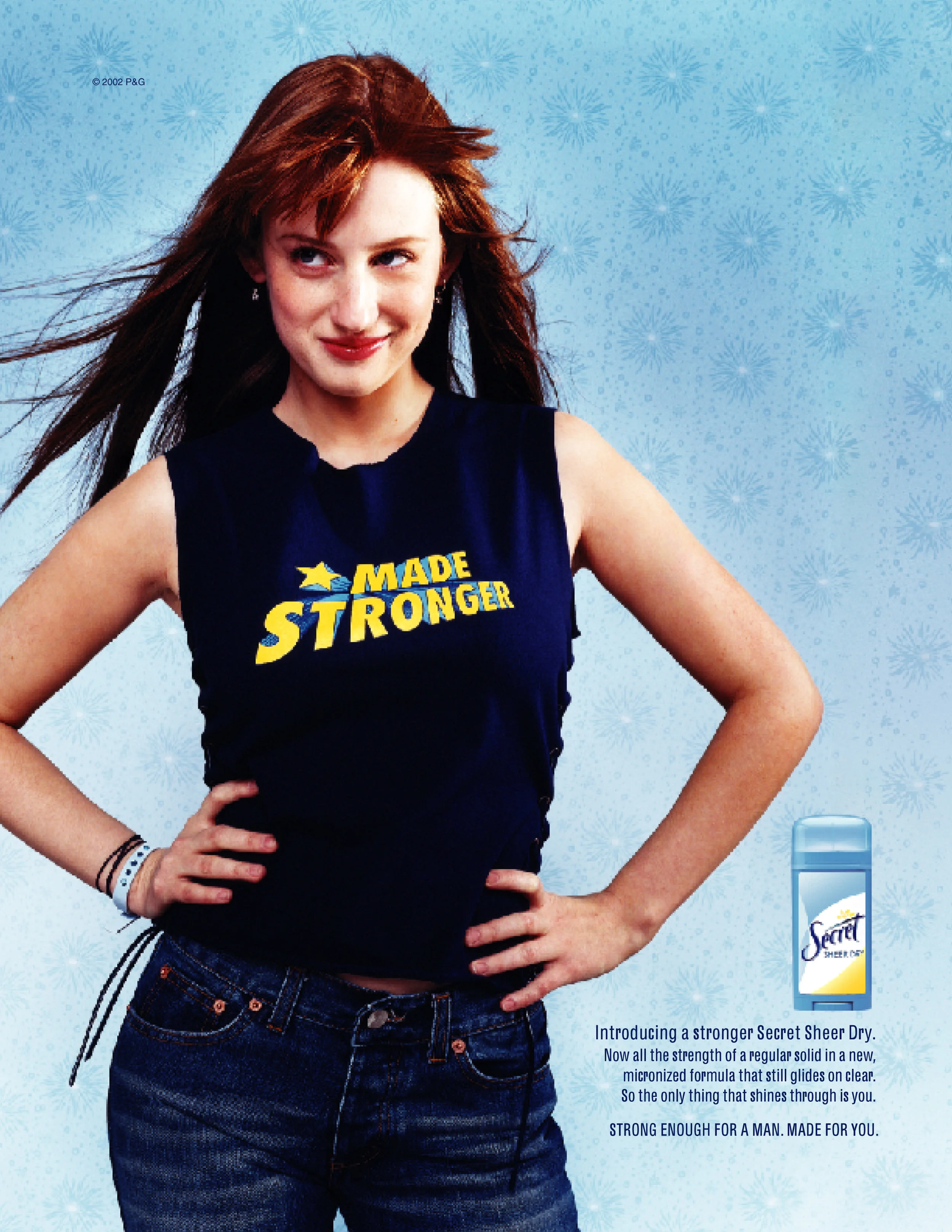
LISTEN The challenge with the Secret brand was taking a successful but antiquated tag line “Strong enough for a man but made for a woman” THINK, and dissecting it to reveal a more current image of feminine strength while simultaneously delivering product benefits. Namely efficacy and a clear application. CREATE In this case the product message is delivered on the wardrobe implying an endorsement of the brand as well as a reflection of their own self-image. Fabulous and strong. The photography is clean, the design is feminine and fresh and the women appear energetic, exuding confidence. For television a mini-series approach was created to depict the story of one woman’s strength under pressure.
Raise
Teddy
Torso
LISTEN. Covid hits. Personal trainers are screwed. Their livelihoods all but disappear. THINK. Promote the efficacy of zoom fitness. CREATE. Let potential clients know that zoom fitness can work for them.
LISTEN. Suffering from low approval ratings, consumer frustration and facing new competition from suppliers entering the area, ComEd needed to make a promise to its customers that it was re-committed to reliable service, innovative energy ideas and trust. THINK. The ReCommittEd strategy/concept worked both internally as a company wide mantra and externally to consumers affirming their commitment to more reliable service. CREATE. To personalize reliable energy benefits and make a public statement affirming their ReCommittEd message, ComEd bought transit boards on routes to and from local ballparks. A strong example of using the right message for the right media. Television used humor depicting the benefit of a power outage as a time for romance that is quickly interrupted by ComEd’s unexpected quick response time.
Mass transit posters to and from Chicago ballparks.
Romance
LISTEN. In the competitive breath mint category, Smint wanted to standout as the ultimate "social necessity." THINK. Playing on our insecurities in the relationship game, Smint asserted itself as the ultimate wingman for a successful hook-up by using the tagline "No Smint, No Kiss." In other words, no Smint, no hook-up. CREATE. Use classic dating imagery to display the message of "Practice safe breath."
LISTEN. Chicago Smile Design (CSD) is a premiere dental service in Chicago whose goal is "...to compassionately provide our patients with the most current and advanced dental care available in a comfortable relaxed setting”. But nobody likes to go to the dentist...THINK. So the marketing strategy was to eliminate the negative, preconceived notions of the dental care experience and create an approachable persona. CREATE. “We speak fluent dental patient” is designed to communicate in a unique way that CSD listens and understands their patient’s need. The headlines are written as if someone has a mouth full of cotton, with the payoff being a translation by Chicago Smile Design. Social media’s readers interest is piqued and then challenged to figure out what it says, all the while learning Chicago Smile Design’s philosophy about patient care as well as the different services they provide. Sandwich boards sitting outside the storefront office made perfect sense in a very walkable neighborhood.
Sandwich boards made perfect sense for a storefront dental office in a very walkable neighborhood.
LISTEN. Local auto repair and service shop known for being "SAAB specialists” needs to expand their clientele to include other high-end imports. THINK. Promote “Certified Car Care” message to gain the trust of import car owners. CREATE. Appeal to import car owners sense of pride in their performance vehicles.
LISTEN. The two questions I get asked most often by startup clients are "Do you do logos?" and "Do you design websites?" to which I answer "Yes" and "No." THINK. Logos are the first step to a brands identity and with my design background I'm happy playing in that conceptual sand box. CREATE. There are times when another designers graphic talents are better suited for a clients final execution. At which point I'll search for a design partner who shares the same vision. I've found that web design is better suited for web designers (I have a recommendation here) or existing on-line templates such as Squarespace.
The Tampax “T” signifies strength, beauty and resilience
Lightfoot provides instruction for yoga, meditation and mindful practices
The Notre Dame College Prep soccer crest represents the schools commitment to a competitive soccer program
Located in Naperville, Illinois, Orazio’s, named after my grandfather, is a family owned bar and grill specializing in “Peasant Italian” food. You should go there sometime :)
Top Notch is a manufacturer of high quality, individually designed work uniforms
The Niles West Theatre logo was designed to cooperate with the school’s existing branding while putting a spotlight on the nationally recognized theatre department
This event logo was designed for Notre Dame’s annual dinner auction fundraiser
What a blast it is, riding the advertising roller coaster! From ideas executed on real film (as in celluloid) to digital campaigns written, shot and posted from our phones one thing remains the same, a good idea is always a good idea. Fortunately for me, my ad footprint is loaded with unique opportunities. From 3-D billboards depicting giant chattering teeth to shooting TV commercials with Michael Jordan, it sure has been fun. So enjoy my archives but remember the ads we create today are the archives of tomorrow.
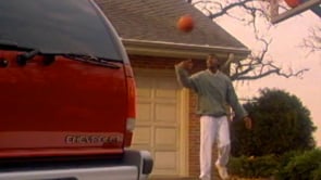
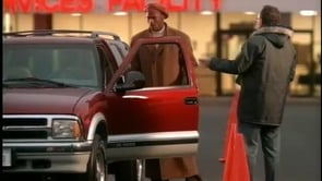
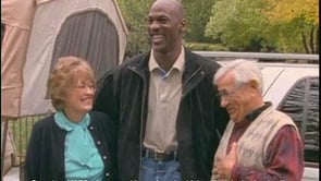
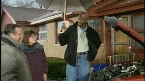
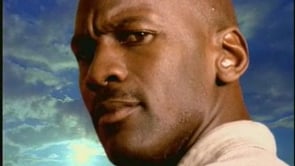
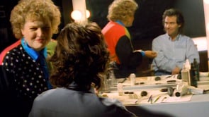
:30 Just Like Yours. SO…when “The Last Dance” aired, the Washington Post named the top 23 Jordan commercials…”just Like You” was #22. Hey, I’m happy to be in the company of the likes of Mr. Spike Lee…but #23 would have been cooler ;-)
MJ Chevy DMV
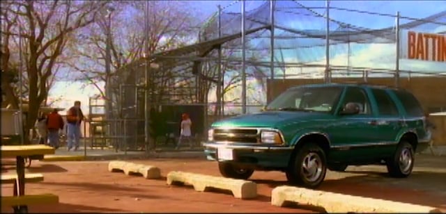
The Chicagoland Chevy dealers had the foresight to sign an NBA rookie by the name of Michael Jordan. Rather than associate Michael with a whole line of vehicles, Michael represented the Chevy Blazer. In the Chicago area Chevy Blazer sales outnumbered the national average 2-1.
MJ Chevy Cardtrick
MJ Chevy Alaska
:30 Down to Earth
:30 Join the Club
WLUP Whole lotta love
WLUP In your eyes
WLUP Still havn’t found
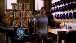
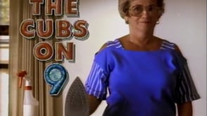
The Cubs Hats
The Cubs were not always World Champions. But the Cub fans have remained steadfast with their commitment to the team and their unique way of expressing it. WGN understood the Cub fan and depicting this understanding in these quirky spots to promote watching the Cubs on WGN TV.
The Cubs Iron
The Cubs Just do it
Dennis Miller Tape
Dennis Miller Leave it
Dennis Miller Figure out your thing
Chevy Batting cage
Chevy Yak
Kahlua White Russian
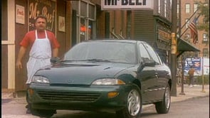
Chevy Mr Beef
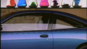
Chevy Lava lite
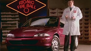
Chevy Ferrara Pan